
Why Weather Apps Show Us So Much We Don’t Need
Open a weather app before leaving the house and there is a good chance you will be greeted by more information than you actually came for.
Temperature. Feels-like temperature. Humidity. Dew point. Wind speed. Wind direction. Gust speed. Visibility. UV index. Barometric pressure. Air quality. Sunrise. Sunset. Precipitation probability. Hourly forecasts. Ten-day forecasts. Maps. Charts. Alerts.
All of these things can be useful.
That is exactly what makes the problem interesting.
The problem with modern information software is rarely that the information is wrong or irrelevant in every circumstance. More often, the problem is that everything potentially useful gets promoted into something immediately visible. Once software can measure a thing, designers feel pressure to show it. Once a feature exists, hiding it can feel almost irresponsible.
So applications gradually become dashboards.
Weather apps are particularly good examples because the underlying subject is enormously complicated while the question most people ask is usually very simple:
What is the weather going to do to me?
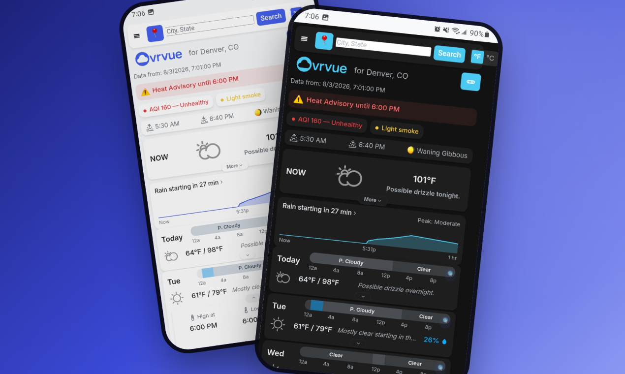
Ovrvue is a weather app built explicitly around that question. Its approach suggests a broader idea that applies well beyond weather: perhaps useful software should not begin by asking how much information it can display.
Perhaps it should begin by asking what deserves our attention.
More Information Became A Proxy For Better Software
There was a time when access to weather information itself was scarce.
You waited for the forecast on television or radio. You looked at the newspaper. Maybe there was a thermometer outside the kitchen window. Detailed meteorological information existed, but ordinary people did not carry a continuously updated weather station in their pockets.
Smartphones changed that.
Now the technical challenge is almost the opposite. Weather services can provide extraordinary amounts of information about current conditions and future forecasts. Applications can organize that data into timelines, cards, maps, graphs, animations and alerts.
The natural response was to expose more of it.
That makes sense. A weather product with twelve data points can appear more capable than one showing four. A screen filled with charts communicates sophistication. A long forecast creates the reassuring impression that the application knows a great deal.
But software capability and user usefulness are not always the same thing.
If someone checks the weather at 7:42 in the morning while putting on shoes, they are probably not conducting meteorological analysis. They may simply be trying to decide whether they need a jacket or umbrella.
The amount of available information has increased dramatically.
The amount of human attention available at 7:42 has not.
A Forecast Is Really A Decision Interface
Thinking of a weather app as a collection of measurements leads naturally toward dashboards.
Thinking of it as a decision interface leads somewhere else.
Consider what people actually do after checking the weather. They choose clothing. They decide whether to walk or drive. They bring an umbrella. They move dinner indoors. They postpone a run. They close the windows. They cover the garden. They change a departure time.
The information matters because it changes behavior.
That means weather data has an unusual property: its importance depends heavily on whether something needs to be done about it.
A pressure reading may be interesting. A rapidly approaching thunderstorm is actionable.
Dew point can tell you something meaningful about atmospheric moisture and comfort. Rain beginning in twelve minutes can tell you to leave the house now.
Both belong in a weather application.
They do not necessarily deserve the same amount of attention.
This distinction is central to Ovrvue. Its own description says the first screen focuses on temperature, imminent rain and genuinely notable conditions, while details such as humidity, dew point, pressure, wind, cloud cover, UV, visibility and other information remain available one tap away.
Nothing has been removed simply because it is technical.
It has been given a different priority.
The Strange Fear Of An Empty Screen
There is a deeply rooted assumption in software design that empty space means something is missing.
A dashboard with six populated cards looks finished. A dashboard with two can look unfinished. A section containing no message at all can feel like a loading failure.
So products tend to fill empty space.
Weather software has plenty of material available for filling it. Even when nothing particularly important is happening outside, there is always another metric, chart or forecast range that can occupy the screen.
Ovrvue makes the opposite choice.
Its stated philosophy is that if nothing notable is happening, nothing notable needs to appear. The product describes an empty screen on a quiet weather day as an honest answer rather than an interface failure.
That is a surprisingly radical design principle.
Not because empty interfaces are technically difficult, but because restraint is difficult.
Showing everything transfers the prioritization problem to the user. The application supplies the data; the person must determine what matters.
Showing less requires the application itself to make judgments.
That introduces risk. What qualifies as notable? What belongs above the fold? When should an interface stay quiet?
Those are harder design problems than adding another card.
But they are also closer to the reason the application exists.
Important Information Is Not The Same As Persistent Information
Software often treats importance as a permanent attribute.
If UV index is important, show UV index every day.
If air quality matters, reserve a permanent air-quality panel.
If wind can be dangerous, keep wind visible.
But importance in daily life is usually conditional.
An air-quality reading may deserve almost no thought on an ordinary day and considerable attention during wildfire smoke. Wind may be background information until gusts become strong enough to affect driving or anything left outdoors. Precipitation probability may be mildly interesting tomorrow but extremely useful when rain is minutes away.
Context changes the value of information.
Ovrvue applies that idea by surfacing a limited number of actionable signals rather than giving every available measurement equal prominence. The app says these can include approaching storms, poor air quality, wildfire smoke, damaging gusts, low visibility and ice, with the signals ordered according to how much they matter.
There is an important distinction here.
Minimalism is often understood as removing things.
This is closer to ranking them.
The data can still exist. The question is whether it deserves interruption rights.
Ovrvue.app Starts With A Different Question
Ovrvue describes itself as a minimalist weather app, but the interesting part of its design is not minimalism for its own sake.
It is the assumption underneath the minimalism.
Instead of beginning with, “What weather data can we provide?” Ovrvue begins with, “What is the weather about to do to you?”
That shift changes the interface.
Minute-by-minute rain information appears when precipitation is relevant and disappears when it is not. More detailed measurements remain accessible without occupying the first screen. The week forecast emphasizes relative temperature ranges and precipitation visually, reducing the amount of numerical interpretation required. Ovrvue also exposes when forecast data was fetched and when the underlying weather model actually ran, distinguishing two timestamps that can otherwise be easily confused.
The philosophy extends to alerts.
Ovrvue includes an optional feature called Event Watch for notable conditions such as meaningful snow, strong storms, ice, heavy rain, damaging wind and extreme UV. But because Ovrvue has no server continuously monitoring conditions in the background, these notes are determined when the app is opened and then left on the device rather than arriving as unsolicited background notifications. Event Watch is off by default, and the user chooses which categories are worth hearing about.
The limitation creates a peculiar kind of restraint.
Ovrvue cannot constantly demand attention because its architecture does not give it that power.
Notifications Changed The Meaning Of “Useful”
The modern notification system began with a reasonable proposition: some information matters even when you are not actively looking for it.
Then almost every application discovered that it could make this argument.
A message arrived. Useful.
Your delivery is nearby. Useful.
A storm warning has been issued. Useful.
Someone liked a post. Maybe useful.
An item you looked at three days ago is still available. Technically information.
The distinction between informing and re-engaging became blurry.
Weather alerts occupy an especially legitimate position because severe weather really can require attention. But that does not mean every atmospheric development needs to produce another vibration.
The interesting question is not whether an application can notify someone.
It is what threshold information should have to cross before software earns the right to interrupt.
Ovrvue’s Event Watch effectively sets a high threshold. The product explicitly describes the feature as a quiet heads-up for notable weather rather than a continuous notification system, and its lack of a background server means it cannot spontaneously wake the user with a new alert.
This makes a technical constraint part of the product philosophy.
Software design often tries to eliminate constraints.
Sometimes constraints are what keep software polite.
There Is Value In Software That Knows When To Stop
Many interfaces are optimized for engagement.
A product that benefits when users spend more time inside it naturally has reasons to create more surfaces, more recommendations, more updates and more reasons to return.
But utility software can have a different definition of success.
Sometimes the best interaction is three seconds long.
You open the app. You understand the situation. You leave.
Nothing has gone wrong.
The software has completed its job.
Weather is particularly compatible with this model because most people do not need to consume weather information. They need enough understanding to continue with whatever they were already doing.
Ovrvue’s design makes this philosophy unusually visible. There are no accounts, ads or advertising networks, according to its about page. Saved location, settings and the user's forecast API key remain on the device, while usage measurement is limited to an anonymous page-view tally.
It also asks users to bring their own Pirate Weather API key rather than hiding forecast access behind an account system. Forecasts are global, while radar is limited to the United States because Ovrvue uses National Weather Service radar data.
These decisions make the product somewhat less invisible than a conventional consumer weather app. A user has to understand where some of the data comes from. There is an initial setup step. The architecture has boundaries.
But transparency and friction are not always opposites of good design.
Sometimes removing every visible dependency merely moves the complexity somewhere the user cannot inspect it.
“More” Should Be A Place, Not A Philosophy
There is nothing inherently wrong with detailed weather data.
A runner may care about humidity. A gardener may watch overnight temperatures. A photographer may want sunrise time and cloud conditions. Someone tracking headaches may be interested in pressure trends. Anyone spending hours outdoors may care considerably more about UV than someone walking from a parking lot to an office.
The argument for simpler weather software is not an argument against depth.
It is an argument against treating depth as the default.
Ovrvue retains detailed information including feels-like temperature, humidity, dew point, pressure trends, wind and gusts, cloud cover, UV, visibility, sunrise and sunset, moon phase, precipitation accumulation and hourly forecasts. Those details are intentionally placed behind the primary view rather than competing with immediate conditions.
This is an important design pattern because it resolves a false choice.
Software does not have to choose between simplicity and capability.
It can choose between simultaneous capability and progressive capability.
Everything does not need to be visible at once for everything to remain available.
That idea sounds obvious when stated plainly.
Our screens suggest we still have trouble believing it.
The Hardest Feature May Be Knowing What Not To Show
We tend to evaluate software by what has been added.
Release notes celebrate new capabilities. Comparison tables count features. Product screenshots favor populated interfaces because populated interfaces look impressive.
Restraint is difficult to measure.
There is no obvious feature-list row for “does not distract you when nothing matters.”
But perhaps there should be.
As software gains access to more data, more models, more sensors and more opportunities to anticipate what we might want, the ability to generate information becomes less scarce. The valuable skill may increasingly be deciding what not to put in front of someone.
Weather makes that tension unusually easy to see.
The atmosphere is endlessly measurable. Human attention is not.
A good forecast does not necessarily tell us everything that can be known about the sky. It tells us enough to understand whether the sky is about to interfere with the day we were already planning to have.
Ovrvue is one attempt to build around that distinction.
And the larger lesson reaches far beyond weather apps.
Sometimes the most useful interface is not the one with the most information.
It is the one that understands which information can wait.
Ovrvue.app is a FREE minimalist weather app that prioritizes actionable conditions first, while keeping detailed forecast information one tap away. It requires no account, and can be installed on a phone’s home screen.
Learn more: https://ovrvue.app