How to Use a Sketchbook Style React Component Library to Create Hand Drawn UI Designs
Learn how to use a sketchbook style React component library to build hand drawn UI designs. Step by step guide for developers who want creative, human style interfaces.
Modern interfaces often look identical. Clean grids, sharp borders, and polished layouts dominate most apps. While this style works well for enterprise tools, it does not fit every project. Some products need personality. Some brands need warmth. Others need a handmade feel.
Developers who want creative visual identity often struggle to build custom styles from scratch. Drawing SVG effects manually takes time. Styling every component to look hand drawn requires skill and patience. That is where a sketchbook style component library becomes useful.
A growing number of developers now use libraries like Sketchbook UI to create hand drawn interfaces quickly. These tools provide reusable components designed to look organic rather than machine perfect. They help teams move faster while maintaining visual uniqueness.
This guide explains how to use a sketchbook style React component library, what problems it solves, and how you can integrate it into real projects.
What Is a Sketchbook Style React Component Library
A sketchbook style React component library contains UI components designed to look like hand drawn elements. Instead of sharp lines and perfect shapes, components appear rough, organic, and artistic.
This type of design style works well for:
- Creative portfolios
- Educational tools
- Kids applications
- Storytelling platforms
- Game dashboards
- Creative SaaS products
Many developers want unique visual identity but lack design skills. These libraries solve that problem by providing ready to use components that already include stylized visuals.
In community discussions, developers described this type of library as making interfaces feel more human and less perfectly polished. Many also noted that these components resemble elements drawn in a physical notebook rather than traditional design systems. :contentReference[oaicite:0]{index=0}
Why Developers Use Hand Drawn UI Components
Traditional UI kits focus on consistency and predictability. That works well for dashboards and business tools. Creative products need emotional connection. Visual style becomes part of the experience.
Hand drawn UI components offer several advantages.
- They stand out in crowded markets
- They support storytelling driven products
- They create memorable visual identity
- They improve brand recall
- They make interfaces feel approachable
For example, educational platforms for children often use playful visuals to keep users engaged. A hand drawn button feels less intimidating than a corporate style button.
Creative agencies also benefit from sketchbook style UI when presenting concepts. Clients often respond positively to visuals that feel original.
Core Features You Should Expect in a Sketchbook UI Library
Most sketchbook style React libraries share several important features. These capabilities help developers integrate the library into real applications without rewriting core logic.
Typical features include:
- Reusable UI components
- SVG based hand drawn effects
- Lightweight styling
- React compatibility
- Framework flexibility
- Simple copy paste usage
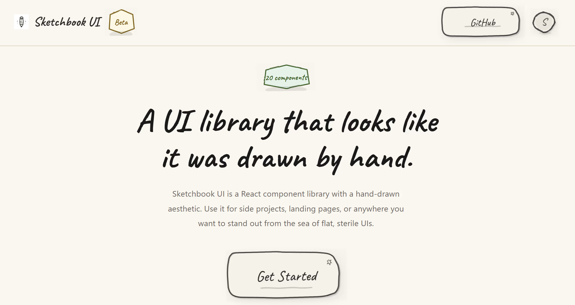
Some libraries provide more than twenty components, including buttons, cards, progress indicators, and form controls. These components allow developers to build complete interfaces without creating new designs from scratch. :contentReference[oaicite:1]{index=1}
Another common feature is compatibility with React frameworks. Many libraries require only React and React DOM to function, making integration easier for modern projects. :contentReference[oaicite:2]{index=2}
How to Use a Sketchbook Style React Component Library
Learning how to use a sketchbook style React component library involves a simple workflow. Most libraries focus on ease of setup and fast adoption.
Follow these steps to get started.
- Choose a sketchbook style component library
- Open the documentation page
- Select the component you need
- Copy the component code
- Paste it into your React project
- Customize styles if needed
- Render the component in your layout
Many libraries focus on copy paste integration instead of complex installation processes. This approach reduces setup time and helps beginners start quickly.
If your project uses a component based architecture, integration feels natural. Each visual element becomes a reusable piece of UI.
Step by Step Example Using Sketchbook Style Components
Let’s walk through a practical example. Imagine you want to create a landing page with a hand drawn button and card.
Start with a simple React layout.
Add a card component that displays information. Then include a button component inside the card.
Next steps include:
- Import the component file
- Place it inside your JSX layout
- Adjust spacing and text content
- Test responsiveness
After rendering the components, your layout gains a sketch style appearance without manual drawing. This reduces design workload while improving visual uniqueness.
For developers searching for curated tools and libraries, resources like nxgntools.com help identify new UI solutions across different categories.
Best Use Cases for Sketchbook Style UI Design
Not every application needs hand drawn components. Choosing the right context improves results.
Here are common scenarios where sketchbook style UI works well.
- Creative portfolio websites
- Interactive storytelling tools
- Educational platforms
- Personal branding sites
- Game dashboards
- Experimental product demos
Creative portfolios benefit the most. Artists and designers often want interfaces that reflect their personality. A sketchbook style layout supports that goal.
Educational tools also benefit. Younger users respond better to visual elements that feel playful.
Design Tips for Using Hand Drawn Components
Using sketch style components requires thoughtful layout planning. Overuse can create clutter. Balance is important.
Follow these design guidelines.
- Limit sketch effects to key components
- Use whitespace to maintain clarity
- Combine hand drawn UI with simple typography
- Keep color palettes minimal
- Test readability across devices
For example, use sketch style buttons while keeping background layouts simple. This creates contrast without overwhelming users.
Another useful practice involves testing different screen sizes. Some decorative lines may require adjustment for smaller devices.
Common Mistakes Developers Should Avoid
Developers sometimes misuse artistic UI libraries. These mistakes reduce usability.
Watch for these issues.
- Using too many decorative elements
- Ignoring accessibility guidelines
- Skipping responsiveness testing
- Mixing too many visual styles
- Using sketch style for serious enterprise tools
Accessibility remains critical. Hand drawn elements must still provide clear interaction states. Buttons should remain easy to identify.
Consistency also matters. Even artistic UI requires visual hierarchy.
Performance Considerations When Using SVG Based UI
Many sketchbook style libraries rely on SVG graphics. SVG offers flexibility but requires optimization.
Performance improves when developers:
- Minimize large SVG paths
- Reuse component instances
- Avoid unnecessary animations
- Compress SVG assets
Testing performance early prevents slow rendering later. Especially in mobile environments, heavy visuals can affect loading speed.
Modern browsers handle SVG efficiently, but careful optimization still matters.
How Sketchbook Style UI Supports Brand Identity
Brand identity plays a major role in product success. Visual style communicates personality before users read text.
Hand drawn UI supports branding in several ways.
- Creates distinctive visual tone
- Builds emotional connection
- Improves memorability
- Supports storytelling driven products
Startups often struggle to differentiate from competitors. A unique interface creates strong first impressions.
Creative founders use sketchbook style UI to reinforce brand voice. For example, a journaling app benefits from notebook style visuals.
Future Trends in Creative UI Component Libraries
The rise of creative UI libraries signals a shift in developer preferences. Teams now look beyond minimal corporate interfaces.
Future trends include:
- Hybrid artistic design systems
- Theme customization tools
- Interactive sketch animations
- Integration with design tools
- Improved developer tooling
As more developers adopt expressive UI styles, component libraries continue evolving. Expect more customization options and improved performance optimization.
Artificial intelligence also influences UI design workflows. Some tools generate variations automatically. Combining AI with sketch style libraries creates new possibilities.
Final Thoughts on Using Sketchbook Style React Component Libraries
Learning how to use a sketchbook style React component library opens new creative paths for developers. Instead of building visual styles from scratch, teams gain access to reusable artistic components.
These libraries reduce development time, improve design quality, and support unique brand identity. They fit projects that require personality rather than rigid uniformity.
As the web evolves, creative interface design becomes more valuable. Developers who adopt expressive UI styles stand out from competitors and build memorable user experiences.