
By Paolo Ronco, creator of OrbitPage
A link in a social profile has a small but demanding job. Someone taps it because a post caught their attention, a recommendation sounded useful, or a business looked worth visiting. The destination has to explain what is available and make the next step obvious.
That becomes difficult when the page is simply a growing list of buttons. A portfolio sits beside an old announcement. A booking link competes with five social profiles. A product appears without enough context to explain why someone should buy it.
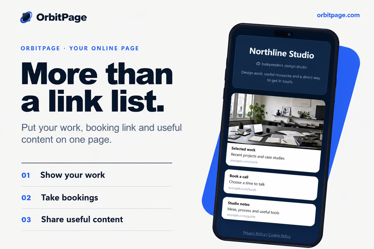
I built OrbitPage around a broader idea: one page can be a useful destination in its own right. It can introduce your work, answer the obvious questions and guide people toward a small number of meaningful actions.
Start with the visit you want to support
Before opening an editor, finish this sentence: “Someone comes to this page because they want to…”
A freelance illustrator might answer “see my work and ask about a commission.” A musician might answer “listen to the latest release and find upcoming shows.” A restaurant might answer “check the menu and book a table.” Those answers lead to different pages, even when the underlying tool is the same.
For an illustrator, three strong examples and a visible enquiry link may matter more than a long biography. For a restaurant, a menu should not be buried beneath press mentions. A useful page gives the most likely visitor a clear path before presenting secondary material.
Give links enough context
OrbitPage combines a visual editor with blocks for links, text, media and other page content. Themes and a live preview let owners shape the presentation while keeping the result visible. The product overview shows how the editor, content and publishing tools fit together.
The practical advantage is the ability to explain a destination before asking someone to open it. A project link can sit beside an image and a short description. An event can have enough information to help a visitor decide whether it is relevant. Contact details can appear where the reader naturally finishes learning about the business.
Use concrete labels. “View the food and drinks menu” tells a guest more than “Discover more.” “Ask about a September commission” is more useful than “Connect.” Clear wording often improves a page more than another decorative section.
Add an offer when there is something specific to sell
For some creators, the next step is a purchase. A template collection, guide or clearly defined service can belong alongside the work that explains its value.
The hosted OrbitPage Shop supports digital products and services through Stripe Connect. It has its own seller setup and publishing requirements; selling is not automatically enabled by adding a link. The Shop guide explains the checkout and delivery workflow.
Think about the offer before the layout. State what the buyer receives, who it helps and what they need to use it. A precise description of a ten-template pack is more convincing than a broad promise to transform someone's business.
Treat publishing as the start of maintenance
A page needs attention after launch. Remove expired events, update availability and check that important destinations still work. Review it on a phone and test it without being signed into the dashboard.
When traffic is sufficient, use analytics to investigate a specific question. Are people opening the portfolio? Is the booking link getting attention? OrbitPage's analytics documentation explains the available reports and the differences between visits, visitors and clicks. A click is evidence of interest, not proof of a completed booking or sale.
OrbitPage is available through managed hosting and an open-source core. The right starting point depends on whether you want to run the infrastructure yourself. Feature availability also depends on the edition and plan.
Build a page around one concrete offer
Consider a fictional illustrator who accepts commissions and sells a small collection of downloadable prints. The page could open with a simple statement about the work and an image that shows the style. A commission enquiry would be the primary action, followed by selected projects and the print collection.
That order gives different visitors a useful route. Someone looking to hire the illustrator can enquire immediately. Someone still evaluating the work can examine examples. Someone who prefers a smaller purchase can explore the prints. The page does not need to treat every destination as equally important.
The introduction should describe the work in terms a potential customer understands. “Illustration for book covers and independent brands” provides a clearer starting point than “Creative solutions for a changing world.” A project caption should explain what the visitor is looking at, rather than assuming an attractive image explains the whole service.
Next, examine the enquiry process. Does the destination ask for the information needed to answer the request? Does it explain what happens next? If an availability statement appears on the page, is it accurate today? These details connect the public presentation to the actual work behind it.
This example is a planning exercise, not a claim about a customer's sales. Its purpose is to show how content order can support several related intentions without turning the page into an unstructured directory.
Review the whole journey before sharing
A useful pre-launch review starts outside the editor. Open the public address on a phone and pretend you know nothing about the owner. Read the first screen, follow the primary link and check whether the destination matches the wording that led you there.
Repeat the exercise for secondary actions. A newsletter link should explain what someone is subscribing to. A product should have enough information to evaluate it. A social embed should earn its space by helping the visitor understand the work. Content that does not answer a question or support an action can often be removed.
Check the page with ordinary conditions in mind. Images should remain helpful on a small display. Long labels should still make sense when they wrap. Text should be easy to distinguish from its background. Important information should not depend on a visitor noticing an animation or interpreting an unfamiliar icon.
Finally, decide what will trigger an update. New work, changed availability and a retired offer are better reasons to revisit a page than an arbitrary redesign schedule. Keep the public destination consistent with what people can actually expect when they contact you.
To explore the experience, start with the live demos. Choose one primary action, build the smallest page that supports it, and add content when it gives the visitor a better reason to continue.