PH
Phone Simulator – Mobile Emulator Tool
Test websites on real phone sizes. Right in Chrome.
Screenshots
 Click to view full size
About Phone Simulator – Mobile Emulator Tool
What is Phone Simulator – Mobile Emulator Tool?
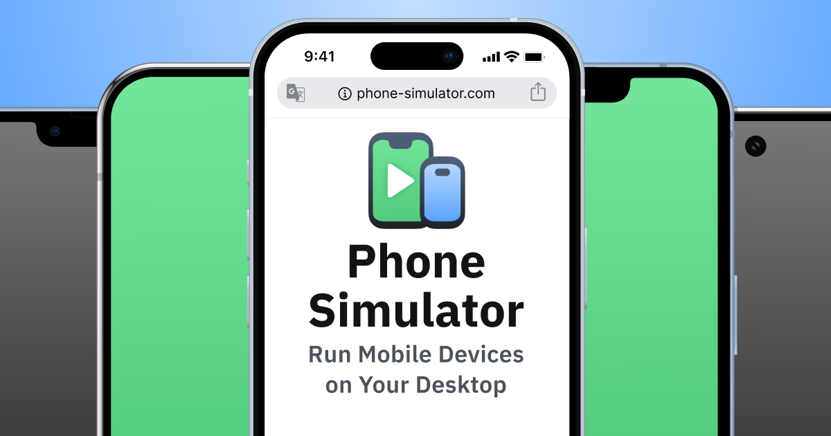
Phone Simulator is a Chrome extension designed for developers, designers, and QA teams to test and preview websites on real mobile device sizes directly within the browser. It allows users to emulate popular smartphones and tablets, providing accurate viewport dimensions and pixel ratios to validate responsive layouts and mobile user experiences. This tool supports over 30 device presets, offers one-click screen rotation, and displays websites using an OS-adapted browser UI with realistic device frames. Compatible with modern frameworks like React, Vue, and Angular, it enables efficient mobile testing across local development environments, staging, and live sites. Unlike Chrome DevTools, Phone Simulator focuses on realistic visual previews, facilitating easy detection of layout bugs and usability issues early in the development process, all without the need for actual devices or external tools.
Problem this tool solves
Hard to preview websites across real phone sizes in Chrome.
How it solves the problem
Chrome extension simulates device viewports, DPR, rotation, and frames.
Target Audience
Developers, designers, and QA teams.
Use Cases
- · Preview responsive layouts on devices
- · Catch mobile UI bugs early
Main Features
30+ device presetsReal viewport & DPROne-click rotationRealistic device framesWorks on any website
Categories
Pricing
Pricing Type: Free
Makers
MP
@mpademirov20230 karma
Analytics
Comments
Add a comment...