
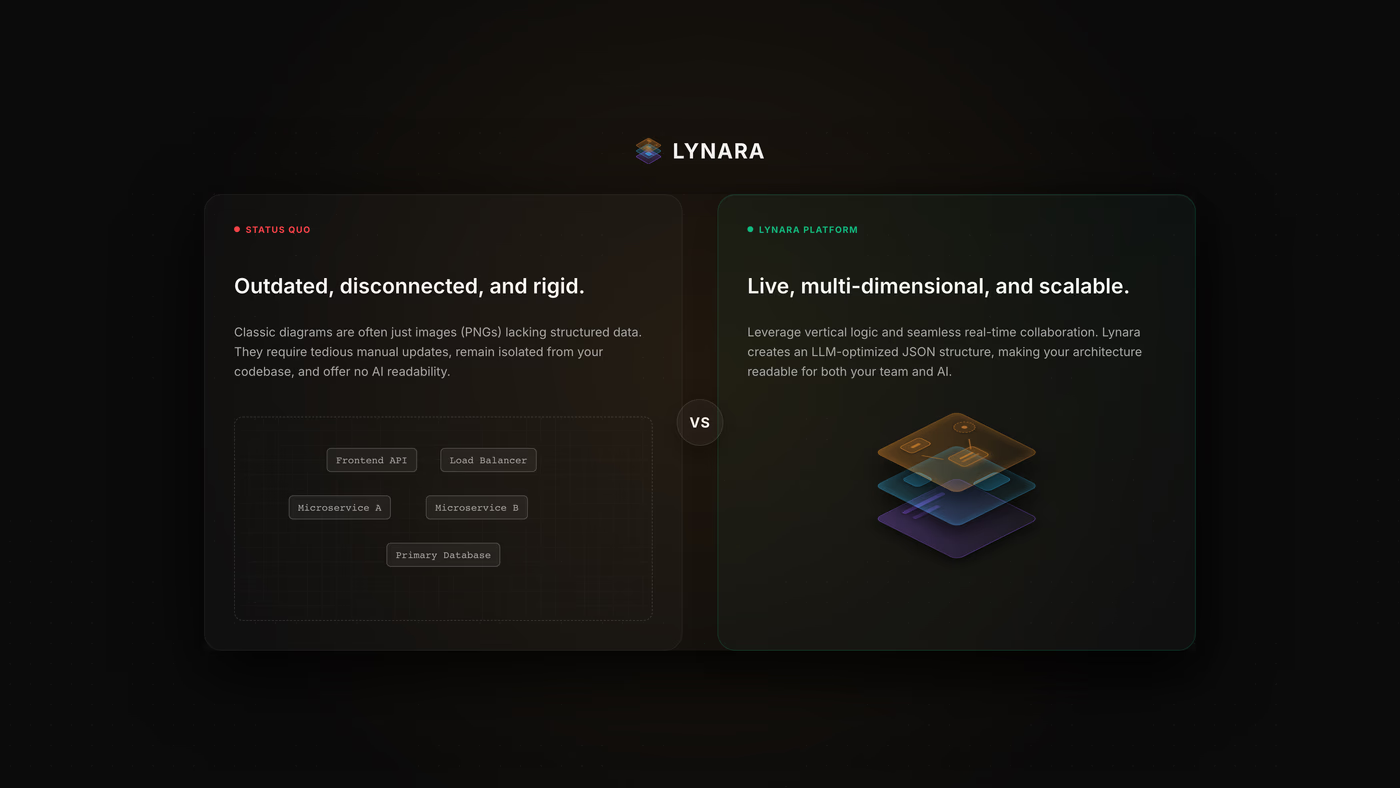
If you have ever joined a new engineering team and asked for system documentation, you already know the story. You get sent a link to a digital whiteboard or an unmaintained Confluence page. When you open it, you see a massive grid of colored boxes connected by hundreds of crossing arrows.
The diagram was usually drawn during a sprint six months ago. Since then, three microservices were added, two databases were split, and an authentication gateway was replaced. Nobody updated the drawing because moving a single box means manually rearranging thirty lines and fixing five broken layout groups. Even worse, the drawing mixes different levels of abstraction. One box represents an entire AWS account, while the box right next to it represents a single Redis key-value store or a small utility function.
This happens in almost every company. Over the past decade, backend and cloud architectures became deeply distributed. We moved from single monoliths to microservices, asynchronous message queues, container clusters, and decoupled frontends. Yet the tools we use to plan and communicate these systems are still general purpose drawing apps. We are essentially trying to plan three-dimensional systems on flat digital paper.
That frustration is the reason we started working on Lynara.
The Root Problem With Generic Whiteboard Tools
Tools like Miro, Draw.io, Excalidraw, and Lucidchart are great for brainstorming, product flowcharts, and quick sketches. But they were never designed to be software architecture tools. They treat every element as dumb vectors and pixels.
First, a line in a drawing tool has no context. It does not know if it represents an HTTP request, a Kafka topic, an event trigger, or an internal database query. If you delete an upstream service, the line stays floating in empty space. If you want to change how data flows between components, you spend half your afternoon snapping line handles to rectangle borders instead of thinking through system design.
Second, generic tools do not understand hierarchy. When you draw a big rectangle around five smaller boxes and label it Kubernetes Cluster, the canvas does not know that those five boxes are children of the cluster. If you drag the boundary, children get left behind unless you manually group them. If you copy the component to another board, nested relationships break.
Third, there is no way to zoom with purpose. When you zoom out on a massive whiteboard, text becomes too small to read, leaving you with an unreadable blur of colored rectangles. When you zoom in, you lose all context of where you are in the overall topology. There is no middle ground between seeing every tiny detail and seeing nothing at all.
Because keeping these flat drawings updated requires so much manual layout work, engineers simply stop updating them. The diagram becomes obsolete, trust in the documentation drops to zero, and the team goes back to the worst possible alternative, which is reading raw configuration files and reverse engineering the setup by hand.
Rethinking the Canvas Around Software Semantics
When we began building Lynara, we decided not to build another generic drawing board. We wanted a tool that reflects the structural reality of software. Systems are organized into vertical tiers: client interfaces, API gateways, application services, messaging brokers, storage layers, and cloud infrastructure.
Every visual element on the canvas should understand where it lives in that stack, what it contains, and what it connects to.
Dynamic Hierarchies and Logical Containment
In Lynara, containers are not just visual outlines. When you drop a service into a container, the system registers a true parent-child relationship. If you move a parent boundary, all child components move naturally with it. If you need to rearrange internal services, the bounding box recalculates its bounds automatically in real time without lag or layout shifting.
This lets teams model real-world infrastructure boundaries such as private subnets, Docker networks, regional clusters, and team ownership boundaries cleanly and predictably.
Level of Detail Zooming
Not everyone reading an architecture map needs the exact same level of detail. A Chief Technology Officer looking at a system overview cares about domain boundaries, public APIs, and overall infrastructure costs. A backend engineer working on a specific ticket needs to know the exact connection type between a worker service and an event topic.
To solve this, Lynara uses a progressive Level of Detail system. When you zoom out to get a broad view, deeply nested containers automatically simplify into clean summary blocks. These blocks display clear badges showing how many internal components live inside them, keeping the canvas readable while preserving the top-level connections between major systems. When you zoom back in, the full internal topology opens up smoothly.
Dedicated Architectural Primitives
Generic rectangles fail to convey how different system components behave. In Lynara, we introduced visual nodes designed around modern cloud concepts.
For example, an asynchronous message broker like Kafka or RabbitMQ looks and behaves differently from a standard database or an internal microservice. Our broker nodes feature stacked multi-tier visual layers that instantly communicate queueing and topic distribution. Connectors snap to precise anchor targets, keeping edge paths clean and preventing the messy line drift common in other diagramming editors.
Streamlining Engineering Workflows
Building a better visual editor is only half the battle. The tool also has to fit into the way engineering teams actually work day to day.
Faster Architecture Reviews
Before writing code, engineers write design documents and request feedback from the team. When these proposals rely on ambiguous whiteboard sketches, meetings get bogged down in basic misunderstandings about boundaries and protocols. With structured multi-layer maps, the entire team can see data flow, dependencies, and potential bottlenecks at a glance.
Effortless Team Onboarding
Bringing a new engineer up to speed on a large codebase typically takes weeks of pairing sessions and reading through fragmented documentation. Giving them an interactive map where they can click through layers and inspect service relationships cuts that onboarding time down dramatically. They can explore the system independently without getting lost in implementation details.
Documentation That Actually Stays Visible
Architecture documentation is useless if it stays locked inside an isolated tool that nobody opens. Lynara integrates directly with platforms like Atlassian Confluence and provides clean vector exports in SVG and PNG formats. Because our export engine captures the actual geometry of connections and container boundaries, the exported images look identical to the live canvas without clipped text or broken lines.
The Vision for Lynara
We are building Lynara to be the single source of truth for software systems. Our goal is to close the gap between how systems are designed on paper and how they are implemented in production.
Future updates will introduce deeper automation, including generating initial architecture maps from infrastructure definitions like Terraform and Docker Compose, as well as real-time health and latency overlays directly on system nodes (partly implemented).
Architecture is the foundation of every reliable piece of software. It determines how your product scales, how easily you can adopt new technologies, and how quickly your team can ship features. You should not have to design that foundation with tools made for generic sticky notes and simple flowcharts.
Try Lynara.io, set up your first multi-layer architecture map, and see what it feels like when your design tool actually understands your stack.